CHALLENGE AND OBJECTIVE
Confirm the relevance of the business idea
Creating a new service can be stressful and risky. Being able to ensure its relevance is a reasonable and comforting step before launching a new business. The objective of this project was therefore to prototype a mobile application on the theme of family bike rides to confirm or not the merits of the business idea.
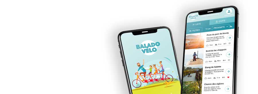
Preview of the final prototype:
Intervention
Responsabilities
Duration of the project
Applied methodologies
- Exploratory research
- Wireframes
- User flow
- Prototyping (paper, low definition clickable, high definition clickable)
- User tests
CONTEXT
Identify user needs
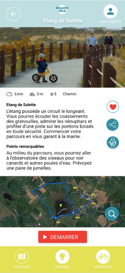
The brainstorming phase with the clients allowed me to identify the specific needs of a family: knowing where to ride, knowing in advance the characteristics of the ground to ensure that the route is adapted to family personal situation (young children, level of difficulty) and family equipment (trailer, bike with small wheels).
It was also pointed out that the app had to be easy to use before and during the ride, i.e. indoors and outdoors (risk of disconnection).
All of these constraints have been taken into account in order to offer a rich and fluid experience adapted to users, i.e. families.

METHODOLOGY
Iterative prototyping
A first prototype was shared with real users to get objective feedback: the app was very well perceived, “interesting” because of its “family” orientation and very pleasant to use. Iterative corrections and optimizations were then quickly implemented to make the prototype attractive, easy-to-use and efficient. The enthusiasm was real during the final tests of the final high definition prototype.
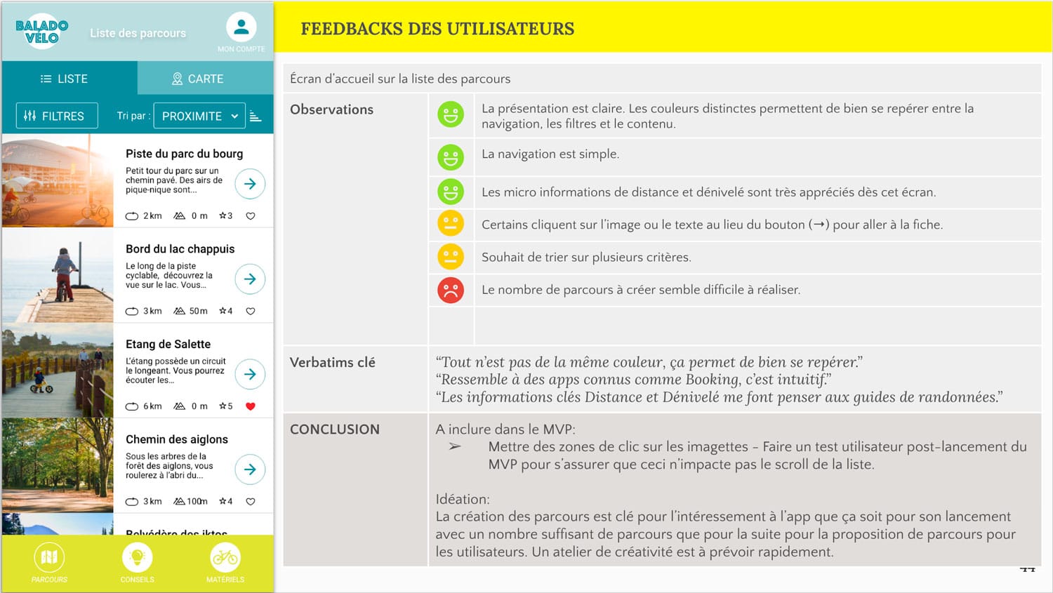
« I think it’s great, when the app is available on the market, I’ll be a customer! It would make me want to go out on my bike more. »
CONCLUSION
Delivery of the MVP and its Style Guide
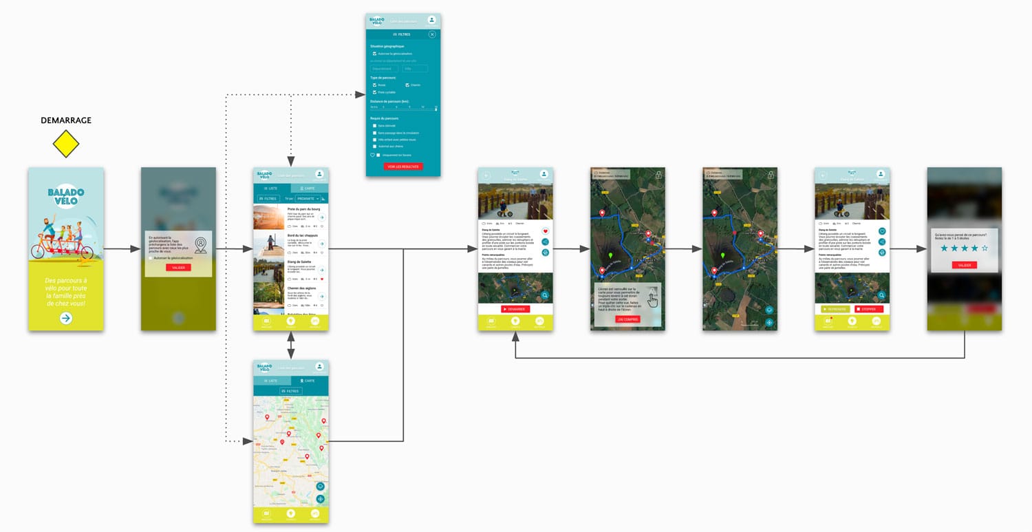
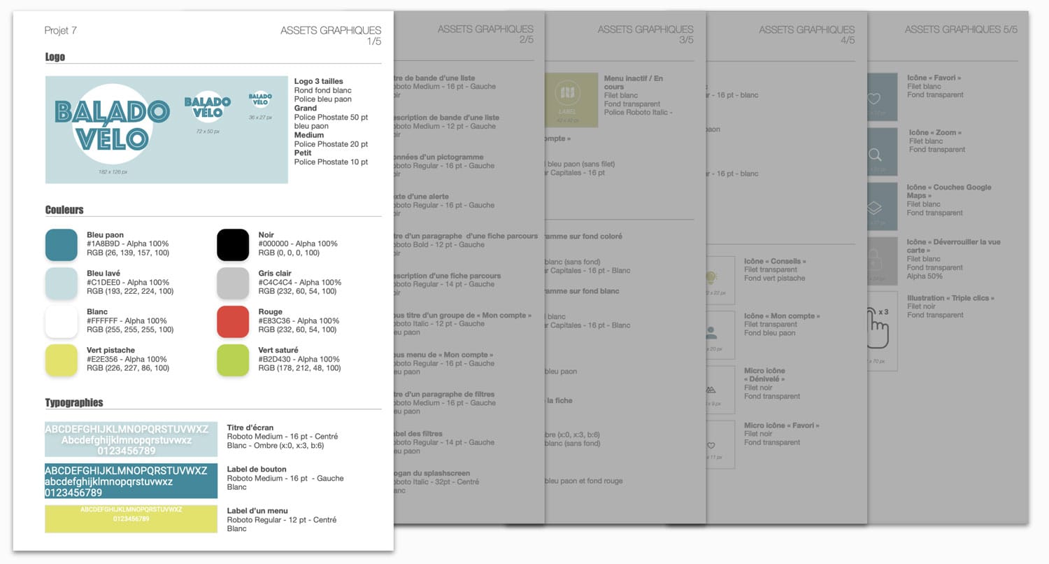
The hypothesis of the interest of such an app was validated and my mission was thus finalised with the delivery of the final high definition prototype in Adobe XD and of all the graphic assets in a Style Guide for the development of the MVP by developers.
« Very good overall work on this project, it’s a pleasure to see! It was a real pleasure to listen to Adeline talk about the project, she explained her methods with great ease and clarity. I didn’t want it to end. Adeline knew how to transmit her energy into the project, I felt really involved! She understood the issues perfectly. Thank you to her for this great project. »
Directrice artistique
Do you have a mobile app project in mind?
Testing your assumptions with a prototype is a reasonable and comforting step before launching a new project. I will be happy to discuss your needs.